color
recent
primary
secondary
complementary
past
my photos for reflection show examples of primary, secondary, and complementary colors.
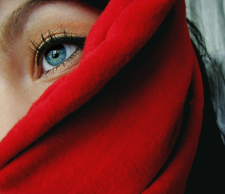
photo 1: this photograph has the primary colors of blue (the eye), yellow (the eyeshadow), and red (the cloth). the whole photograph had the saturation and contrast increased to intensify the colors. the colors are both natural and manmade because the eyeshadow and cloth were artificial but my eye color is natural. i made sure to include a color in each corner of the photograph to increase the impact.
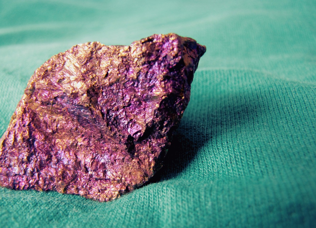
photo 2: this picture shows secondary colors. the rock is purple and gold while the cloth is green. the rock is natural but the cloth is manmade. i increased the saturation and contrast, like in the last photo. i used to rule of thirds to make the rock the focal point of the photo.
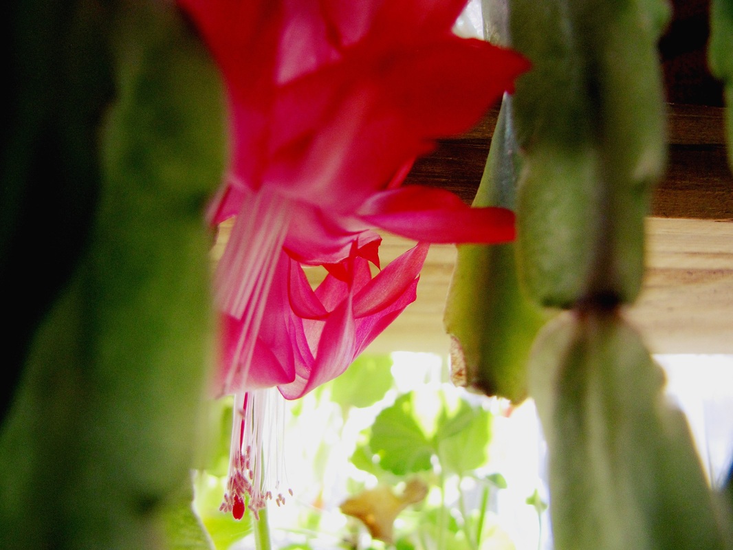
photo 3: the environment was the focus of this picture. the colors are complementary because lime green and pink are across each other on the color wheel. the subjects are completely natural because they are both plants that i found in my house. the photo has a more obvious composition because the flower is in the center, but the green plant is out of focus to create emphasis.
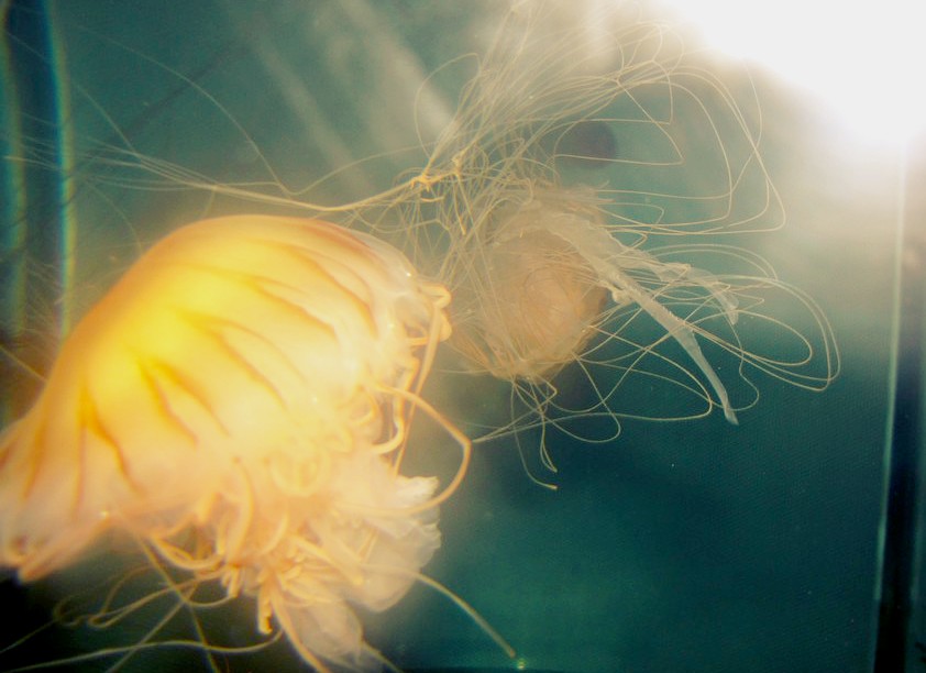
past photo: this photo was taken at the boston aquarium. the subjects are two jellyfish. i like this photo because it has a dream-like quality because of the light in the corner and the glow of the jellyfish. there isn't a specific color scheme that this photo conveys from the color wheel, though it could be related to analagous colors because there is green, blue, and yellow.
photo 1: this photograph has the primary colors of blue (the eye), yellow (the eyeshadow), and red (the cloth). the whole photograph had the saturation and contrast increased to intensify the colors. the colors are both natural and manmade because the eyeshadow and cloth were artificial but my eye color is natural. i made sure to include a color in each corner of the photograph to increase the impact.
photo 2: this picture shows secondary colors. the rock is purple and gold while the cloth is green. the rock is natural but the cloth is manmade. i increased the saturation and contrast, like in the last photo. i used to rule of thirds to make the rock the focal point of the photo.
photo 3: the environment was the focus of this picture. the colors are complementary because lime green and pink are across each other on the color wheel. the subjects are completely natural because they are both plants that i found in my house. the photo has a more obvious composition because the flower is in the center, but the green plant is out of focus to create emphasis.
past photo: this photo was taken at the boston aquarium. the subjects are two jellyfish. i like this photo because it has a dream-like quality because of the light in the corner and the glow of the jellyfish. there isn't a specific color scheme that this photo conveys from the color wheel, though it could be related to analagous colors because there is green, blue, and yellow.
